Color is more than decoration—it’s an emotional language. We explore how artists use bold hues in public art to shift mood, spark memory, and transform shared space.
From ancient frescoes to contemporary installations, artists have long understood the powerful connection between color and emotion. Mark Rothko’s luminous fields of color were intended to provoke deep, meditative states, while Van Gogh’s vibrant yellows and blues conveyed joy and hope. Today, artists working in public art continue this tradition—using color not only for beauty but also to spark emotional resonance in shared spaces.
Contemporary artists harness the full spectrum to create powerful emotional experiences in public and private environments. The projects we feature are chock full of bold, arresting color, reminding us that hue and tone do far more than decorate—they communicate.
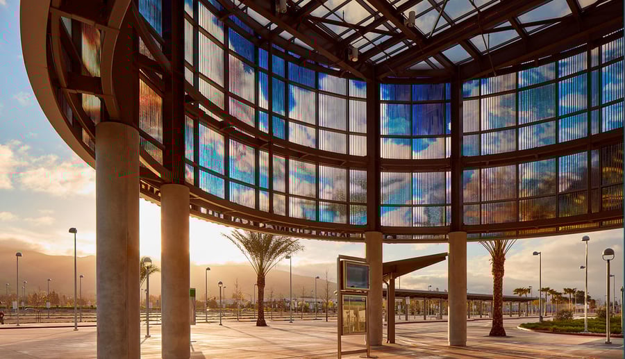
One of the most breathtaking examples is Radiance by RE:site, a suspended dichroic glass sculpture that radiates in the lobby of the El Paso International Airport. This monumental piece refracts sunlight into a constantly shifting spectrum of colors. The experience is ethereal and uplifting, welcoming travelers with a burst of kaleidoscopic light. Its ever-changing surface creates a moment of calm and wonder amid the hustle of an airport—a reminder of how public art can reset our emotional state through the simple play of color and light.


In Los Angeles, the Historic Broadway Station mural turns an underground transit hub into a riot of hues and shapes. Created by artist Ralph Gilbert in collaboration with LA Metro, this massive mural is a visual explosion of color that transforms the mundane into the magical. For commuters, the vivid palette makes the daily journey more engaging, while also honoring the cultural history of the Broadway corridor.


Color also intersects with texture and material in Air Wall Statement, a mural composed entirely of vintage postage stamps. This work by Peter Hite creates a richly layered surface of micro-images, unified by an overarching color scheme. From a distance, it reads as a bold mural; up close, viewers discover thousands of individual pieces that hint at stories, messages, and history—underscoring how color can guide attention and reveal meaning over time.


The emotional impact of specific colors is central to many of these works. Horizon, a cocoon-like sculptural seating by Init and Creos, embraces blue, offering calm and tranquility with its flowing forms and serene palette. Blue, often linked to introspection, turns this installation into a place of quiet reflection and a soothing universe.


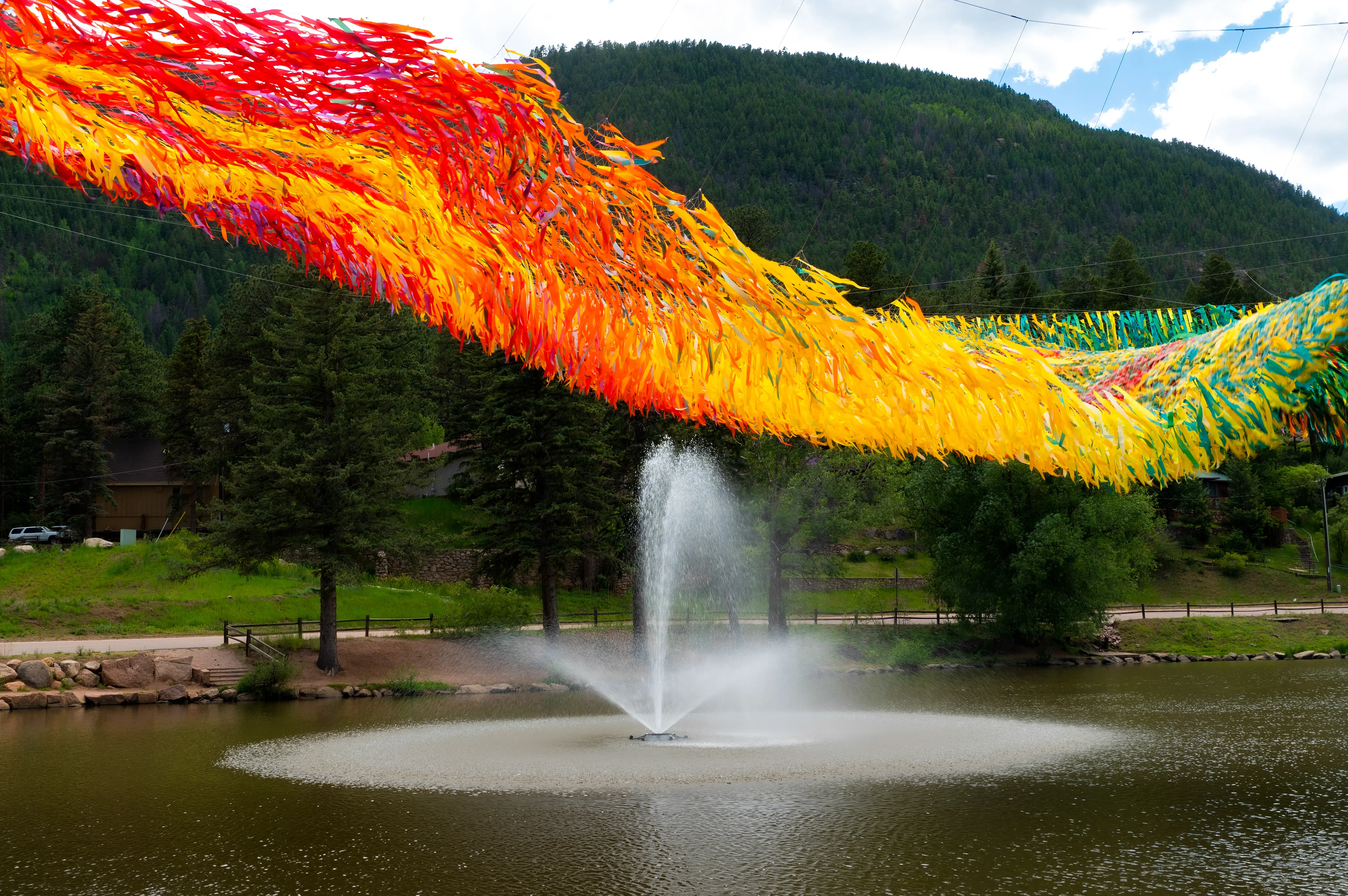
Yellow, associated with joy and vitality, takes center stage in Blankets 2 by Spanish artist SpY. This striking work uses hundreds of metallic emergency blankets—gold on one side, silver on the other—to wrap an outdoor façade in shimmering yellow. As the sunlight hits the installation, it crackles with energy, symbolizing transformation, hope, and resilience.


These projects, and many more, demonstrate how color is more than aesthetic: it is emotional language made visible. Through thoughtful collaboration and intentional design, public artists are painting the world with feeling.
%20expanded.png)
Relevant posts