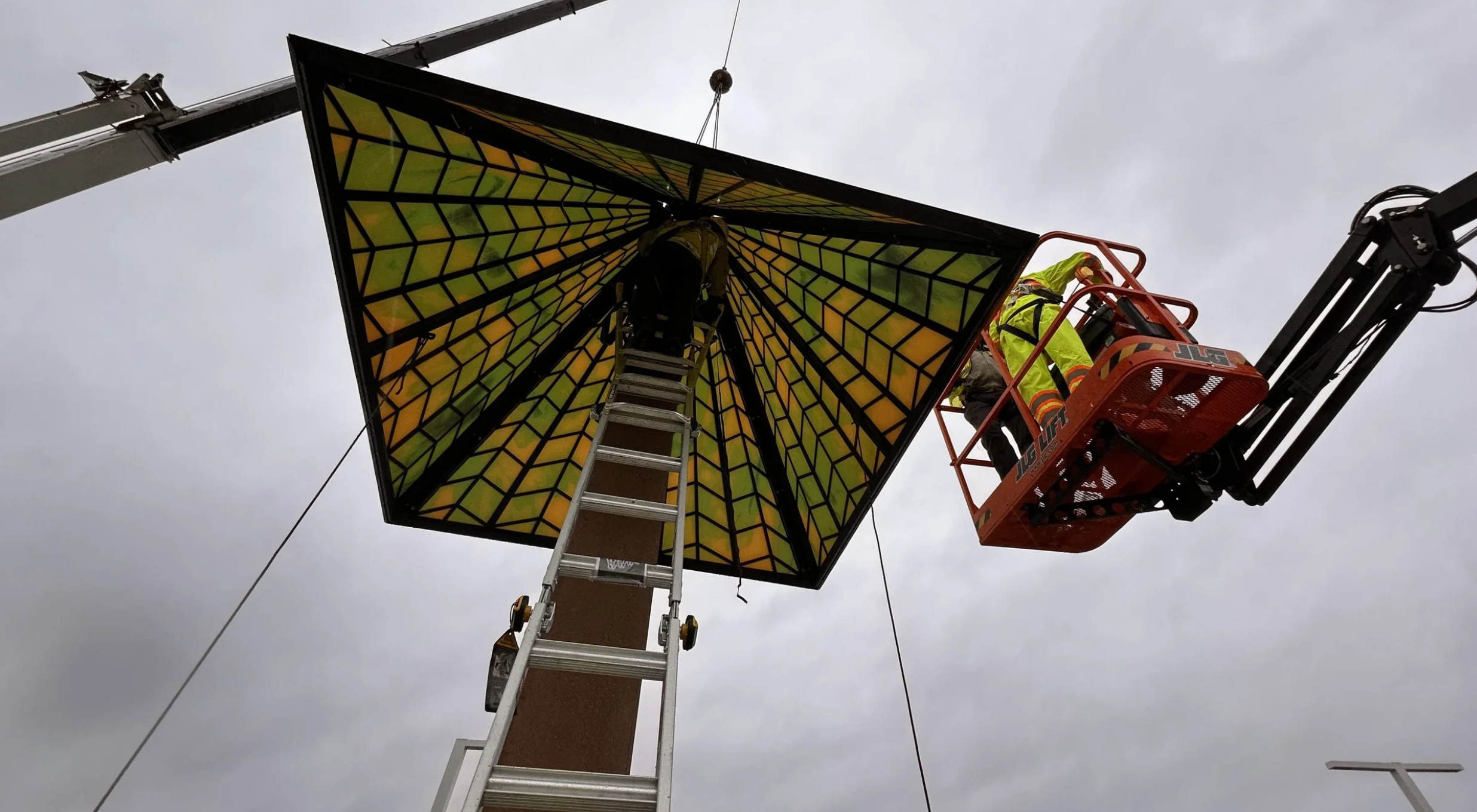
Typography is no longer confined to books and screens—it has emerged as a dynamic force in public art, transforming how we experience language in our physical environments. In this article, typography takes center stage as the organizing principle, highlighting projects that elevate the written word to the level of sculpture, murals, and monuments.
Today, public artists are reimagining how letters, words, and numbers can shape our surroundings—and our imaginations. The projects featured use letterforms as visual anchors and sculptural elements, making them intrinsic to the architectural and emotional fabric of a space. In many of these works, text becomes image—bold, dimensional, and unforgettable.
Consider Pillars of Hope and Justice created by RE:site and fabricated by Metalab. This evocative installation features six towering steel columns composed of 14 vertical "flutes," each laser-cut with the text of Dr. Martin Luther King Jr.’s iconic speech. Rising up to 14 feet high, the columns are both elegant and monumental, marrying classical forms with contemporary messages. Here, typography becomes a medium of memory and reverence, turning powerful words into enduring structures.


Some installations take typography into the digital realm. WA/ONDER, a video-based artwork by Bob Faust in Chicago’s Fulton Market, uses animated letterforms to explore emotional entanglements. The letters are treated like musical notes, each with a role in creating rhythm, harmony, and visual resonance. It’s a poetic, multisensory experience that demonstrates how digital tools can amplify the expressive power of type.


Other artists turn to the sky for inspiration—quite literally. In Poems to the Sky, created for the O, Miami Poetry Festival, artist Randy Burman painted children’s poems onto rooftops beneath the flight paths of planes arriving at and departing from Miami International Airport. Viewed from the air by thousands of travelers each day, the poems stretch the bounds of where and how we read, turning typographic art into a fleeting, airborne encounter.


Even commercial spaces have embraced typographic installations. In central London, Acrylicize’s Timeless installation suspends oversized LED-driven letters from a 30-meter-high atrium, displaying the current time in London, New York, and Sydney. Here, type becomes both utility and spectacle—blending global connectivity with bold design.


From laser-cut steel to digital animations and rooftop murals, these projects redefine the role of typography in art and architecture. They demonstrate how words can inform, inspire, and envelop us. Through these powerful works, typography becomes more than communication—it becomes a physical, emotional, and artistic experience.
%20expanded.png)
.png?width=900&name=Frame%209210%20(3).png)


